

.svg)


The Evolution of Library Websites
The Web is Constantly Evolving
The dynamic nature of the internet offers unique challenges and opportunities for public libraries. The challenges are clear: patrons have more online experiences to choose from than ever before and, as a result, libraries are competing against a myriad of platforms, from social media to entertainment to ecommerce and much more.
However, none of these alternatives can truly replace the unique and incredible value public libraries bring to communities. From vast and growing collection of books and media to impactful programming, libraries enrich people’s lives. To succeed online, libraries must carry the enriching and empowering experiences of their physical locations to their websites.
One starting point is to see how websites have evolved over the years and, in turn, understand what design elements, user experiences (UX), and technology capabilities successful websites use today. Likewise, it’s also important to recognize obsolete and long-abandoned practices to ensure your library website breaks (and stays) free of that legacy weight.
This quick guide will give you a high-level look at how websites have evolved over the years and, as importantly, where the internet is heading in the near future. Having this understanding will help you build your library website project with the right foundations to drive your goals both today and over the long term.
Homepages
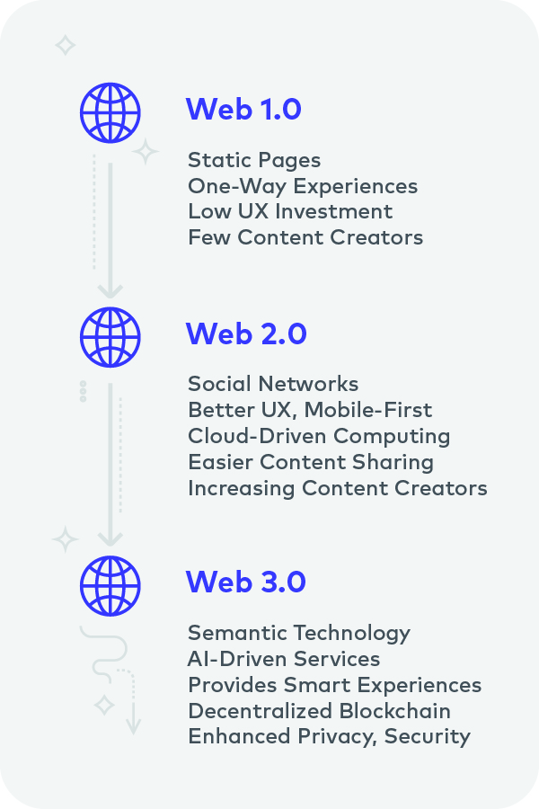
Web 1.0
Known as ‘Web 1.0’, the first pages on the internet were passive, one-way experiences that conveyed information to the user.
Looking at the Space Jam website, one can see that the homepage didn’t focus on guiding the user to a specific outcome. Yes, they can visit the inner pages for information, but there isn’t a “pull” towards signing up for a service, buying a product, or subscribing to a newsletter.
Likewise, there wasn’t any real emphasis on UX, especially in terms of design and accessibility. The example above was difficult to read due to the way the text was imposed over a busy background, and it wasn’t clear if the visual assets were clickable.
In the 1990s, most organizations didn’t see their websites as a central asset for engaging their users. In many cases, the website was an ancillary ‘nice to have’ that could serve as an information board or just (like above) a neat marketing gimmick.

Example of a Web 1.0 Homepage (Source)
Early Web 2.0
MSN.com has been a classic Web 2.0 driver through its integration of different user-engagement features. For example, the MSN homepage provides users links to login to services like Hotmail and MSN Messenger. It plays a role in driving people to connect with others.
In addition, Web 2.0 saw developers pay more attention to design and UX. Compared to the Space Jam example, one can see greater use of white space to make content easier to read, logical content placement, and clearly marked URLs directing users to other pages.
By this point, more organizations started leveraging their websites as assets. Some used websites to drive awareness towards their physical storefronts, while others started building businesses centered on their websites (e-commerce, media streaming, etc.)

Example of an Early Web 2.0 Homepage (Source)
Late Web 2.0
The core goals that drove early Web 2.0 (e.g., user engagement) have evolved to encompass many more elements.
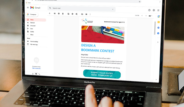
Today’s strongest Web 2.0 websites deliberately focus on driving specific user outcomes. In the Arapahoe Public Library homepage example above, there’s a focus on making patrons aware of certain programs, enabling them to log in (to access the collections catalog), and get information about their library, to name a few.
To achieve those goals, the web developers and library team paid careful attention to how they used white space, how much content someone could see at a glance, navigation cues (such as menus, buttons, etc.), and overall aesthetic appeal.
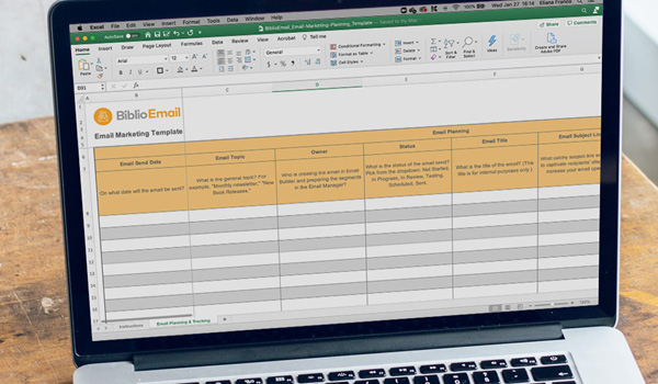
Today, many organizations rely on their websites to help drive goals, like user growth, for example. So, rich toolsets like marketing integration., the ‘New Email Sign Up’ banner above) are a must-have alongside the ability to measure metrics and results.

Example of a Late Web 2.0 Homepage (Source)
Web Pages
[Web 1.0] Static Pages with Limited Utility
Technically, most Web 1.0 pages leveraged mostly HTML to deliver content.
They’re barebone designs with limited functionality outside of reading text, clicking links, and downloading small media files, like images, low-fidelity audio files, or short videos.
Many of the technical constraints were a product of the time, not just due to limited web development tools, but also a market where few people had any internet connectivity at all, much less high-speed.

Example of a Web 1.0 Web Page (Source)
[Early Web 2.0] Interactive & Informative Pages
Web 2.0 drove the adoption of many new technologies, such as Ajax, JavaScript, CSS, and others. This helped web developers incorporate rich features into their pages, like videos. But it also opened the door to user-generated content (UGC) that helped make pages interesting to users, and empowered users to leave an impact.
YouTube’s earlier builds were textbook examples of this dynamic. Not only did the website grow on its UGC input, but it also leveraged user reviews and comments to build a community of creators and commentors (or both!).
Finally, algorithms designed to understand user behavior were also introduced, opening the door to personalized experiences (like video suggestions). In addition to new web technologies, the spread of high-speed, always-online internet connectivity helped drive Web 2.0 growth, especially in multimedia.

[Late Web 2.0] Tangibly Valuable Experiences
Today, websites can leverage web technologies in many ways. They leverage UGC to deliver community-driven experiences (like Reddit, TikTok, etc.), entertain, and provide tangible resources and services to people.
Stark Library is a great example of using one’s website to deliver tangible support to people. As public libraries partner with more platforms (like LinkedIn) and invest in technology, they need to think about how they can deliver those resources to people in accessible ways. A great website can play that role.

Example of a Late Web 2.0 Web Page (Source)
Brand-First to User-First
[Web 1.0] Brand-Heavy
In the Web 1.0 days, an organization likely invested in a website to showcase its brand. So, a major emphasis was to showcase the logo, announce a new product or service, or publish a press release.
The website was a supporting piece for some other campaign or program, but not a central asset. It was more about showing, not driving measurable online actions (like sales, sign-ups, etc.).
This isn’t surprising because the internet was a new landscape in those days, and technology for both building and consuming the web wasn’t nearly as complex, robust, or scalable as it is today.
Moreover, marketing strategies at the time tended to put the product/service at the center, not the consumer, of their engagement experiences.
That said, towards the end of Web 1.0, some brands (like Apple) began building towards the idea of using the web to help sell their products, and this would develop further in the Web 2.0 era.

[Early Web 2.0] User-Focused
By the mid-2000s, organizations started seeing more potential in the web, especially when they put users at the center. The top performers of this era centered on empowering people to produce and consume content (especially YouTube, Facebook, Reddit, etc.).
In addition, they set the standard for UX, web design, and features for other organizations, even those that weren’t social media or multimedia platforms. Features like Single Sign-On (SSO) where a user just needs to log in once to access multiple online services or personalization (like recommendations) emerged from these players.
While different, they helped cement the idea that web experiences need to respect the user’s needs and preferences. Doing that would help the business or organization achieve its goals, such as driving more sales, subscriptions, or even physical storefront visits.
Continuing with the Apple example, while the company still puts its product at the center visually, the underlying web experience is now user focused. You can see a more deliberate focus on driving user engagement, such as product purchases, software downloads (like iTunes), or accessing technical support and documentation.

[Late Web 2.0] User-Centric
Today, users are not just at the center of the web experience but, arguably, are the purpose of one’s web investments.
A growing number of public libraries recognize this fact as they rebuild or upgrade their websites to empower their patrons and enrich their lives. Every feature and design element aims to solve a problem for the user or provide a benefit.
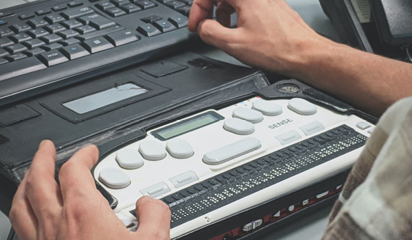
For example, digitally strong libraries leverage SSO to provide a streamlined login that works across their website and online catalog. That way, users don’t feel like they’re jumping between different websites.
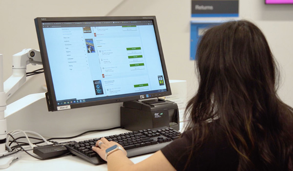
Likewise, digitally strong libraries want to reach as many people in their communities as possible. They’re leveraging responsive web design to provide experiences across both desktop and mobile so that a larger group of people can access their services via the platform of their preference.
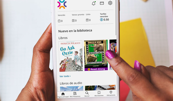
To ensure their users get an optimal mobile experience, they consider developing dedicated apps a critical piece to delivering convenient and personalized experiences.

A Glimpse of Web 3.0

AI

Blockchain

Personalization
‘Web 3.0’ – also called ‘Web3’ – isn’t fully understood yet as it’s still developing. It’s possible that emerging technologies, like AI and blockchain, will play a role in creating Web3 experiences. One emerging aspect of Web3 is that it’ll take user-centricity to another level by making the user the leading agent in security, accessibility, and data privacy. Though distant, it’s a great idea to think about setting the groundwork for Web3 in your current digital environment; build a website that draws on the right technologies to center on the user today. However, for a public library, that is much easier said than done.
Ultimately, public libraries generally aren’t technology organizations. Yes, some libraries have taken the lead in applying technologies, but few develop them in the first place. They don’t have the resources to build, nurture, and grow development teams, closely study web technologies continually, and then design new solutions. Finally, developing technology isn’t the focus of the public library; rather, it’s to support local communities, and that mission should involve leveraging the best technology available.
That’s why working with a software-as-a-service (SaaS) partner is a prudent step to continue focusing on your mission without worrying about compromising on your technology stack. Leveraging SaaS gives you the library catalog, website, and app solutions you need out of the box, accelerating your timelines so that you can deliver impactful experiences to your patrons sooner. Not only that, but SaaS will ensure that your website and other digital experiences reflect the evolving web environment, from UX to technologies to standards and more.